Collapsing Conceptual Complexity
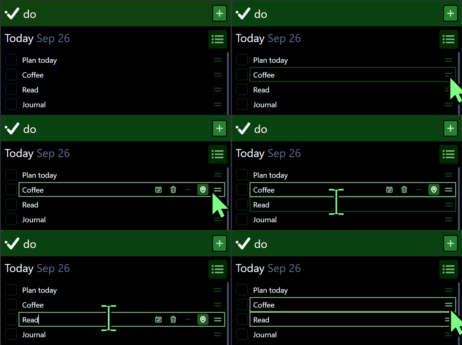
A couple months back, I filed a bug against Cue (with misspellings and all): “Figure out a new ‘selected todo’ affordance, so that editing text can just put a box aroudn the entire todo, not just hte editing field”.
I had noticed a mismatch between focus and selection. Focus put a border around the todo text, selection put one around the entire todo UI. They were slightly different, and somewhat confusing. I thought that they needed more differentiation, to make it clear to the user whether the todo was selected, and could be moved around, or whether it had the keyboard focus, and could be edited.
But that wasn’t the problem.
In fact, that was a possible solution. The problem was deeper, and there were other hints at that deeper problem.
The code smelled: two different divs in the todo entry HTML had an identical ring border style applied.
Focus and selection were mutually exclusive. If the todo text was focused, selection was cleared. To select a todo pulled the focus out of the todo textbox.
Each of these hints pointed towards the real problem: editing todos had too much conceptual complexity. More than any typical user needed to reason about to get the job done.
This wasn’t a technical problem, or even, at root, a design problem. Rather, it came from lack of clarity, due to historical accretion of features. When selection was added, I didn’t fully account for the natural workflows of using Cue.
Yes, it’s a relatively simple planning and todo app. But that simplicity is core to its design. It’s not trying to be a universal checklist app, with complete flexibility in how it’s used.
Instead, there are clear workflows. In this case, these two workflows are distinct:
- Working the daily plan, by checking off todos.
- Building the daily plan, by writing them down, moving them around, etc.
Those workflows have always helped me to simplify the user experience, and they provided the constraints I needed to build the right solution to the root problem of conceptual complexity around editing todos.
The key insight was not the first solution I came up with, distinguishing two states visually.
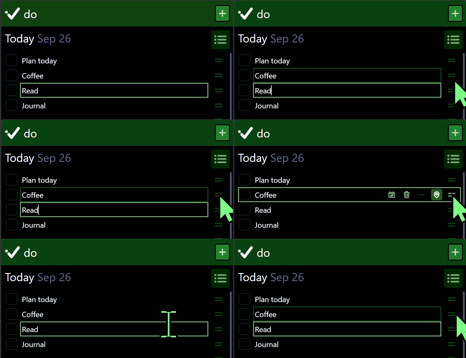
The key insight was to stop asking the user to think of them separately: move selection with the focus.
When a todo textbox is focused, the todo is selected. While the focus stays within the textbox and quick actions bar, the selection remains. If it leaves, the selection is cleared.
And now, selection and focus can be indicated exactly the same way. When building the daily plan, they are essentially the same state.
Cue just got a little simpler, for the person using it.